Across all facets of life, we’ve grown accustomed to and have adopted simpler ways of doing things – meal-kit delivery services to cut out unwanted grocery shopping, swipe-able dating apps to meet partners faster, and mobile banking to easily split a bill with friends on-the-go, just to name a few. Due solely in part to the rise of technology and having things just a button click away, we expect most things to be simple and void of unnecessary steps and clutter.
This very same ideation mirrors over into today’s world of advertising in the form of minimalist design. Brands want to portray themselves and their campaign messaging strategies in quick-hitting, yet meaningful ways that an audience can easily understand and relate to. Forcing a viewer to think that extra second in order to understand an advertisement’s meaning or having them struggle with a less-than-an-ideal UX when navigating a clunky website can quickly flip a switch inside the viewer’s head and ultimately turn them away from the brand at hand. But how do we avoid these hiccups?
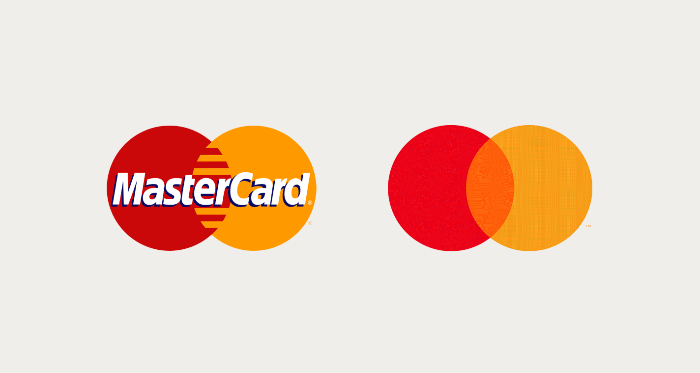
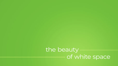
Tell straight-forward, concise stories. Utilize clean, legible designs. Remove excess clutter. Embrace empty space. Although these aspects of minimalist design are not new concepts, they have been vastly accepted in the past half-decade and can be noticed in branding updates to reputable brands like McDonalds, Google, MasterCard, Southwest Airlines and Airbnb among countless others.